Thursday, March 29, 2012

Tangible User Interfaces

What are Tangible User Interfaces?
Tangible user interfaces are user interfaces that allows a user to interact with digital information using physical objects. They consists of 4 characteristics such as:

1. Physical representations are computionally coupled to underlying digital information

2. Physical representations embody mechanisms for interactive control

3. Physical representations are perceptually coupled to actively mediated digital representations

4. Physical state of tangibles embodies key aspects of the digital state of a system.

Examples of Tangible User Interfaces

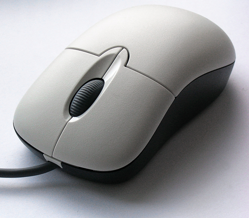
Computer mouse
Although we use a computer mouse everyday, many of us do not realise that this device is actually an example of a tangible user interface. The user drag the mouse on a flat surface to move the pointer on the computer screen. The direct relationship between the movement of the mouse and pointer on the screen has allowed the user to operate the computer easily.


Microsoft Surface
Microsoft Surface is a system that is designed to look like a table and has a multi-touch display which allows many users to use it at the same time. It has the ability to detect objects that are placed on it and provide users with many functions to manipulate these objects such as transferring photos via different devices. The video below shows how Microsoft Surface can be used.


Reactable
Reactable is a musical instrument designed to create and perform music. It is a clear and glowing round table with plucks placing on its surface. The users are able to turn the plucks and connect them to other plucks to create music with different elements such as synthesizers, effects, sample loops and control elements. When the pluck is placed on the surface, the pluck lights up and interact with other plucks. Music becomes tangible with Reactable as the user is able to see these interactions on the surface. The video below shows the usage of Reactable.


Tangible User Interface Alarm Clock (TUI-AC)
TUI-AC is an innovative alarm clock which consists of a ball and a pull-ring. The user set an alarm by pulling the ring out of the ball and throw it like a grenade. The pull-ring contains a sensor which measures the distance between the ball and itself. The alarm is louder when the ball is thrown further away from the pull-ring. When the alarm rings, the user needs to get up from bed to find the ball and insert the ring into the ball in order to switch off the alarm. TUI-AC is very useful for people who have difficulty waking up every morning.


References:

Monday, March 26, 2012

Understanding Brain Computer Interface

Have you ever wanted to communicate with others or move objects using only your mind just like the characters you saw in the movies? Isn't it great to be able to do it? This is now becoming a reality with the development of Brain Computer Interface (BCI). BCI is defined as a system of interaction between the brain and a device.

How BCI works?
A set of electrodes called electroencephalograph (EEG) is attached to the scalp or implanted onto the specific brain surface to receive better and more accurate signal. The EEG measure differences in the voltage between brain cells. This signal is then magnified, filtered and read by a software. BCI works in reverse for its input to the brain. The signal such as video is converted into voltages that are sent to the EEG and activate the brain cells. The person will then receives the signal of the video.

Application of BCI
One of the applications of BCI is for entertainment. The mind of a user can be used as a controller to control a video games or replace a remote control to change the channels of television. An application for entertainment is the release of a toy called "Star Wars Force Trainer". It uses a headset to detect concentration signal from the user's brain. When the user concentrates, the headset receives the signal and transmit it to a microchip that switches on the fan and lift up the ball inside the clear tube.


Another application of BCI is the implementation of devices that can help disabled people to live normally. The disabled person can use his mind to control such device to overcome his physical difficulties. He first visualises an action with a headset attached to allow the software to learn the brain signals. After a few tries, the user thinks about the action to transmit the brain signals to the device which will read the signal and execute the action. Some examples of such devices are robotic arm and mouse cursor.

Here is a video of Tan Le, co-founder and president of Emotiv Systems, showing how a user controls the computer with his mind using BCI.


Limitation of BCI
There are still challenges when implementing BCI.

1) Complexity of the brain
The electric signals from the brain do not totally determine a person's thought and action. There are also chemical process that the EEG cannot read.

2) Weak signals received by the EEG
These brain signals are so weak and small that they are easily interfered by signals generated by other actions.

3) Inconvenience of BCI equipments
Some BCI need a wired connection to their equipments. Although there are BCI that are wireless, they still require the user to carry a computer around. 

These challenges can be overcome with research and development of BCI. The EEG can be improved to receive better brain signals and the equipment of BCI can become wireless and lighter. With these challenges being overcome, I believe that this technology will be able to benefit us in making our lives more convenient in future.

References:

Saturday, March 17, 2012

User Reading Patterns

There are certain reading patterns that users follow when reading content on a web page - the most prominent of these is the "F shaped reading pattern". Research from Nielsen Norman Group's usability studies has revealed that the majority of users scan a web page in the shape of the letter F. The study involved 232 users, and this pattern holds across web pages and different content. There are three main components to this pattern:

  1. Users will read the top part of the page horizontally, forming the top bar of the F. 
  2. Users then skip some content and read horizontally again. This forms the middle bar of the F, and tends to be shorter than the top bar.
  3. Users then skim over the rest of the page vertically, creating the leg of the F. Depending on the user, this skimming can be either slow or fast.


Heatmaps of user viewing patterns. Red regions are where the user spent most of their time, followed by yellow and blue. 
It is easy to discern the F pattern by looking at the above images. It is more discernible in the middle image than the other two since it is a rough pattern that users follow rather than a strict rule that everyone follows. Nevertheless, there are important implications.

This study reveals that users do not read the majority of content on a page. There are certain sections that they are most attentive to, and they just skim the rest of the page. Since they are most attentive to the content at the top of the page, the most important content should be placed there. If the page is a news article, the content at the top of the page should be interesting and compelling enough to convince the reader to stay. On an e-commerce site, the most important content such as payment information, pricing details, etc should be placed at the top. On a search site, the most important results should be placed at the top. Though users will likely skim content after the first 2 paragraphs, Nielsen suggests a method to draw users in while they are skimming. By starting paragraphs with information carrying words, users are more likely to be engaged in the content.

Source: http://www.useit.com/alertbox/reading_pattern.html


Tuesday, March 6, 2012

Windows 8!

On 1st June 2011, at the D9 conference in Redmond, Washington; Microsoft demonstrated the next generation of Windows for the first time, internally code-named Windows 8. And on 29th February 2012, Microsoft released the consumer edition of Windows 8. In the first day of its release, the Consumer Preview was allegedly downloaded more than one million times.

Here is a video of the process that the developers went through while building Windows 8.


It features a new Metro-style interface that is designed for touchscreen, keyboard, mouse, and pen input. And for the first time since Windows 95, the Windows start button is no longer available - having been replaced by a sliding panel-based menu. The tile-based Start screen is similar to the Windows Phone operating system. Each tile on the screen represents one application and displays relevant information. For instance, an email app will display the number of unread messages and a weather app will display the temperature and humidity ratio  etc. The scalable, full screen views of the apps is customisable.


Utmost care has been taken to ensure that the OS is now more flexible and customizable. This ensure a more personal approach for the user.
  • The inviting lock screen which can be personalized to heart's content
  • The log-in page has gotten a face lift
  • Simplified Control Panel, Task Manager, Windows Explorer and the onscreen Volume Bar
  • As the user begins to configure his Twitter, RSS feeds, Facebook, preferred weather location and other such things, the home screen grows more and more personal.


Due to the touchscreen capability introduced, the following features that are supported become more meaningful:
  • Fluid and natural switching between running apps
  • Ability to snap and re-size an app to fit the size of the screen. This facilitates multitasking using the capabilities of Windows.
  • Picture password, which allows users to log in by drawing three gestures in different places on a picture. This is in addition to a PIN login system that authenticates users using a four digit PIN


The default font size for the widgets such as the control panel has been increased as compared to the previous versions of Windows. Quite evidently, this is again to support the touchscreen functionality.

The Task manager now looks a lot more personalized and easier to understand as compared to the one that we currently see in the other Windows versions.


Although the new interface is designed and optimized for touch, it works equally well with a mouse and a keyboard. In trying to add new features, Microsoft has not compromised on the existing features. It also works on a wide range of screen sizes and pixel densities, from small slates to laptops, desktops, all-in-ones,  and even classroom sized displays.

The apps use the power of HTML5 and standard JavaScript to tap into the capabilities of Windows. The apps can use a broad new set of libraries and controls designed for fluid interaction and connectivity. They can add new capabilities to Windows and to other apps, connecting to one another through the new interface.

There are quite a few limitations that seem to curb the usability:

  • The totally new revamp of the layout has left many users confused. It's not obvious enough how to shut down the PC or put it to sleep. The Escape key can no longer be used to exit programs. Instead it now serves the function of leaving the Start screen and returning to app that you were last using. To leave an app, you have to press the Start button - similar to tapping the home button on a mobile phone. 
  • Necessity to use a lot of short cuts in-spite of them being limited and inconsistent. For example, the Start-Tab can be pressed to toggle between open apps, but only two

There's a lot more to come before the Beta version is released in probably another half a years time!

References:
1. Previewing 'Windows 8' by Julie Larson-Green

2. That Windows 8 Experience? Confusing. Confusing as hell - The Guardian
3. Windows 8 on a laptop In-depth preview by Dana Wollman


Monday, February 13, 2012

FoodX - Project Proposal

The Problem
  • The fridge often contains expired food, which can smell bad and worse, can cause health problems.
  • We buy food, but we have no good method to track its expiration date.
Our User
  • Our primary user is the person that does grocery shopping in the household. Generally, we expect our primary users to be mothers.
  • Secondary users are other people in the household: spouse, children, etc
Our Persona - Julie


Scenario
Julie is a mother of two children. She wants a way to track the expiry date of the items she purchases at the grocery store to prevent her children from getting food poisoning. She uses FoodX to automatically input expiration dates for the items she purchases at a grocery store. When any of the items expire, she is notified, so she can throw them out.

Existing Solutions
1. Expiry Tracker

  • The items on screen look cluttered.
  • The UI makes the process of entering an item look a chore

2. ExpireTrack


  • We expect our user to use the app while in the kitchen, hence an online solution is not optimal
  • The interface is not mobile friendly

3. FridgePolice


  • This is by far the best existing solution
  • However, as seen from the reviews, the users are not quite happy with the UI

FoodX
FoodX is a mobile app that allows the users to easily input and track the expiration date of their grocery items.

Features of FoodX
  • Product recognition via barcode scan
  • Automatic reminders before expiry date
  • Items can be tagged with photos
  • Automatic food categorization and built in food expiry information
  • Search through existing items
  • Sort by expiry date and item type

Use Cases of FoodX
  • Scanning an item to automatically retrieve item type and expiration date
  • Manually inputting item
  • Manually inputting expiration date
  • Taking a picture of the item
  • Viewing expiration dates of existing items
  • Manually deleting items
  • Searching for items
  • Searching items by expiry date
  • Sorting items by item type

Prototype Wireframes: Design 1


Prototype Wireframes: Design 2


The Team
  • Kwa Jun Yong - Experience with Web Design and Coding.Enjoys UI
  • Aaaron Wong Jun Weng - Experience with Web Design
  • Sreshta Vijayaraghavan - Experience with game development and automation testing
  • Aravindh Dilli Dorai - Experience with creating wireframes and managing projects


Challenges
  • Creating a UI that is fun and friendly for mothers, yet functionally powerful.
  • Deciding between design prototypes
  • Steep learning curve for Flash5 and HTML (The team is not familiar with these technologies)

But we are excited to create an amazing app that lets mothers track the expiry dates of their foods!

Monday, February 6, 2012

Error Message Design

As everyday computer users, I'm sure each of us have received error messages at least once, if not a couple of times already. An error message is essentially used to alert the user that a problem has occurred. A warning on the other hand will alert the user of a problem that is most likely to occur in the near future.Error messages are often displayed using modal dialog boxes, in-place messages, notifications, or balloons. A good error message should entail the following:
  • Inform the user that a problem has occurred
  • Briefly describe the problem using terms understandable even to the IT noob
  • Provide the user with a solution 
Apart from the information presented, how we present it also plays a very important role. We may be presenting the user with all the useful information, but just the way we present it might not be user-friendly and could lead to discomfort and dissatisfaction. The 10 Golden rules certainly have to be adhered to:
  • Visibility
  • Consistency
  • Familiarity
  • Affordability
  • Constraints
  • Navigation
  • Feedback
  • Recovery
  • Flexibility
  • Style
This aside, the following are the basic guidelines to follow. Examples have been provided wherever necessary. 
  • Avoid error messages if possible - Introduce constraints wherever possible thereby reducing the chances of going wrong. If the error can be automatically rectified, refrain from involving or interrupting the user. Also consider if the problem is relevant to what the user is currently working on.

  • Explicit indication that something has gone wrong - Do not use misguiding icons. For instance, dont use the warning icon to display an error. It may water down the severity of the presentation, but the user might be left confused. Also do not just tell the user that there is an error. Should try as much as possible to be specific even if we're unsure of the error.


Compare the above unknown error dialogue to the one below. Clearly goes to show that even if the problem is unknown, try to point the user to other sources which may be of help.

  • Human-readable language - We need to keep in mind the fact that non-IT professionals use the system as well. When we try to explain the reason behind an error, we need to be as non-technical as possible. For experts within the field, they may be given the option to view such details. But on the outset, it's best we dont baffle the user.

  • Polite phrasing- without blaming the user or imply that user is stupid or is doing something wrong
Do not blame the user as above. Use passive voice instead. Compare with below.

  • Precise descriptions of exact problems. Do not over communicate to the user. It would result in nothing more than confusion.
The above error message is good. But it tries to provide the user with all the information at one go. Compare this with the one below which essentially tries to solve the same problem.

  • Constructive advice on how to fix the problem. It's not enough to only highlight the problem. A workable solution is to be provided as well.

We've encountered this problem innumerable times! Sending or not sending an error report makes no difference. It closes the application anyway and sometimes results in the system hanging. When the suggestion is of no use, might as well not provide it.

  • Visible and highly noticeable - both in terms of message itself and how it indicates which dialogue element users must repair
  • Reduce the work of correcting the error (e.g. list of possibilities)
  • Hypertext links may be used to connect a concise error message to a page with additional background information or explanation of the problem.

  • Avoid Sound alerts - It's best not to have jarring sounds accompanying the dialogue boxes. Again, this depends on the environment in which the user is working. In an already chaotic environment, this feature would be of no use. Only when the error is extremely critical and needs immediate user attention we may employ this feature.

Saturday, January 28, 2012

An example of a bad GUI

A graphical user interface is a very important aspect of computing these days. It can be found on smart phones, computers, and many other electronics out there. Many users will rely on this graphical user interface to use the product either efficiently or conveniently. Hence, it can make or break a certain product. Take for example, the following graphical user interface:


At first glance, one could not tell what it is used for. Moreover, don't you think that seeing this would make you feel like this:

What went wrong???

What went wrong exactly?
  • Overall representation. It is too messy. The user might not know where to start, where to look at. Basically, there is no proper layout at all.
  • The use of colours. Too many colours are being used. Colours can be a very useful tool in terms of graphical user interface design but in this case, it has been overused.
  • Functionality over usability. This is a common flaw behind many graphical user interfaces. It has too many functions in a page.